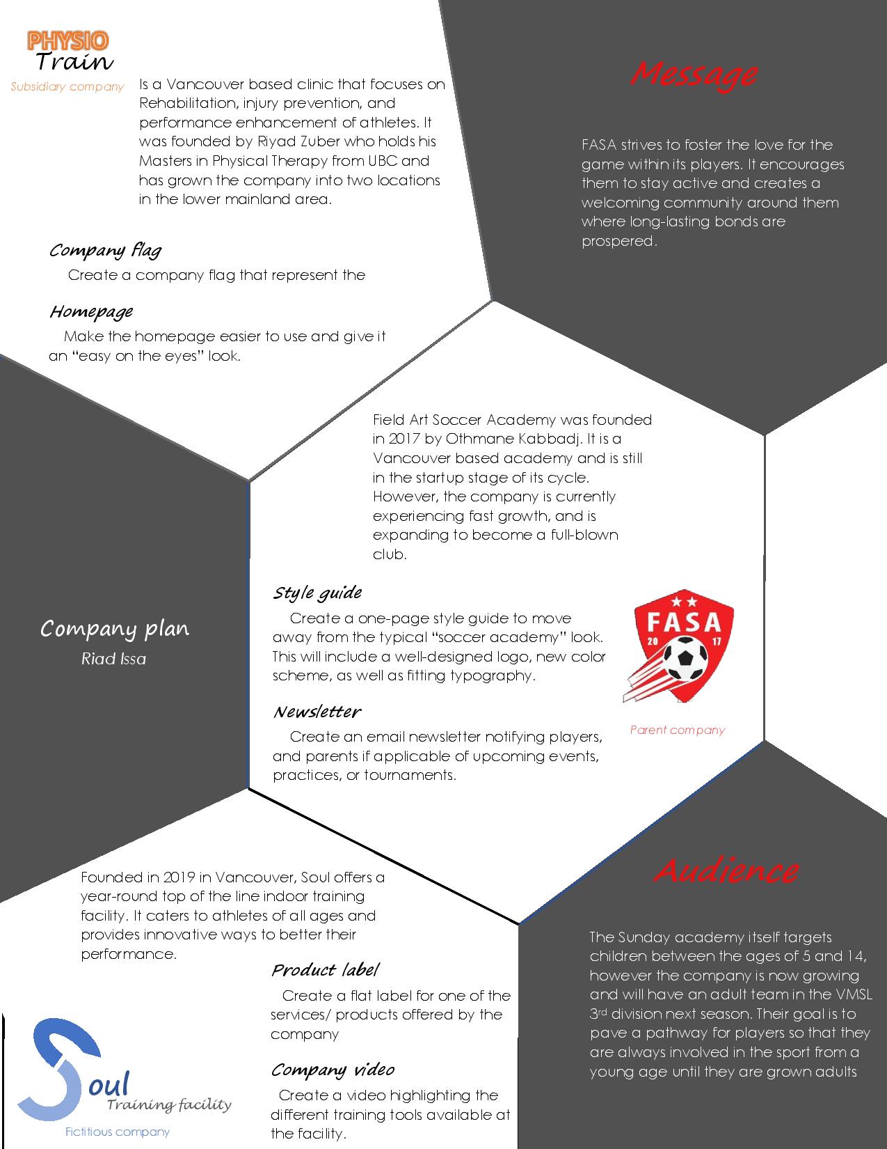
13C Final Portfolio

Overview

For this last week I had to combine all my work into an 8 minute PPT presentation. I really enjoyed editing my work and looking back at where I started. Here is a PDF version of the file:

Process

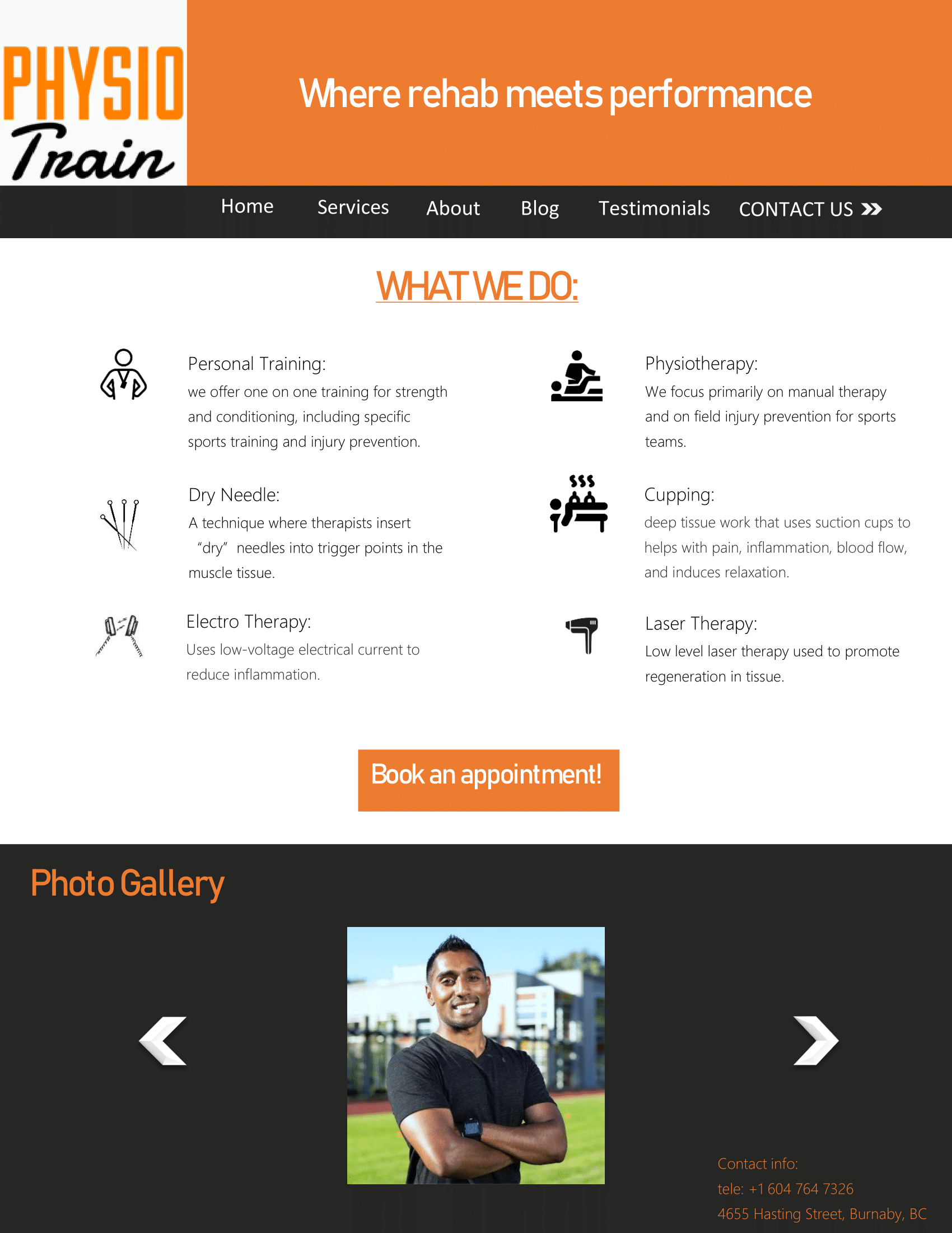
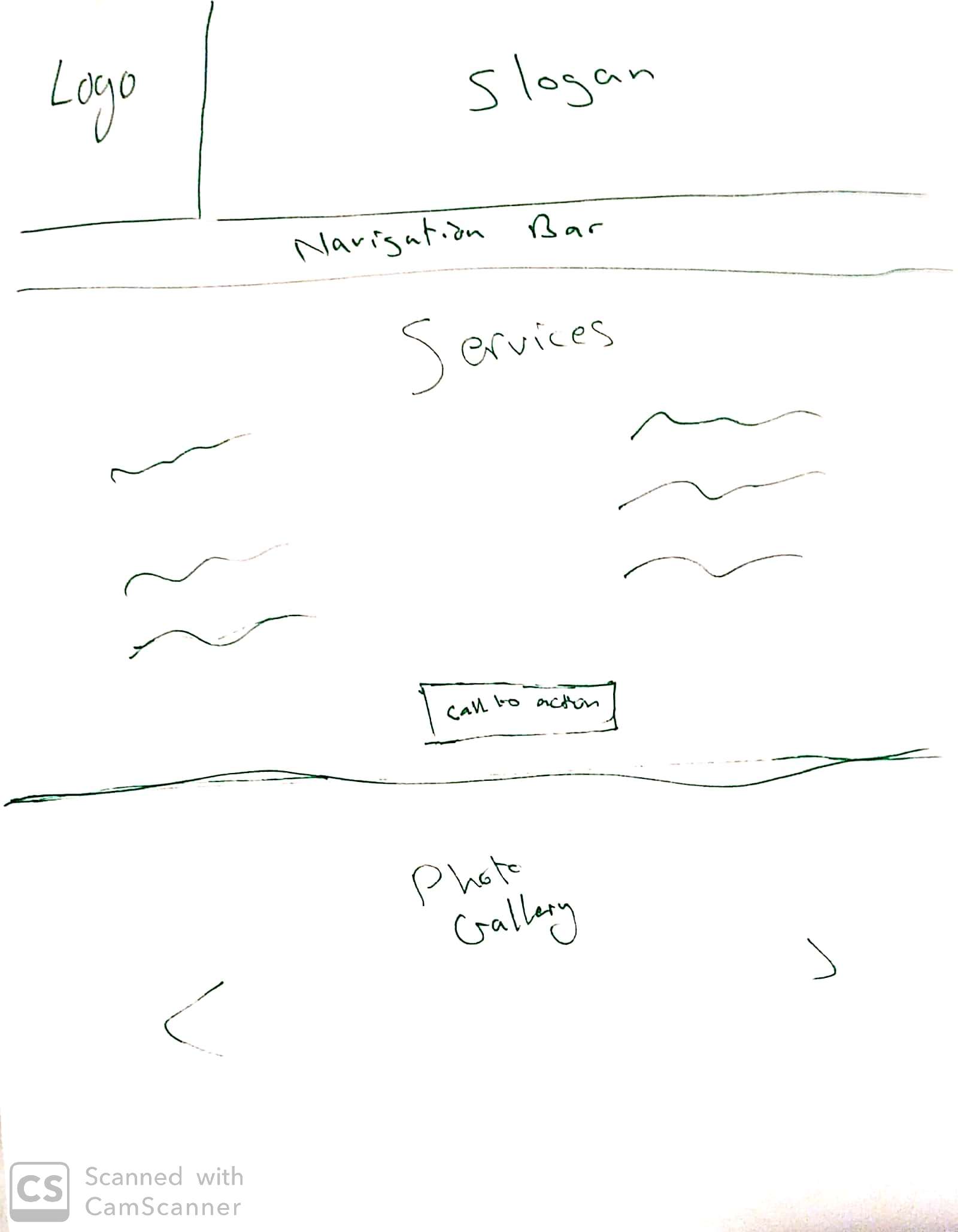
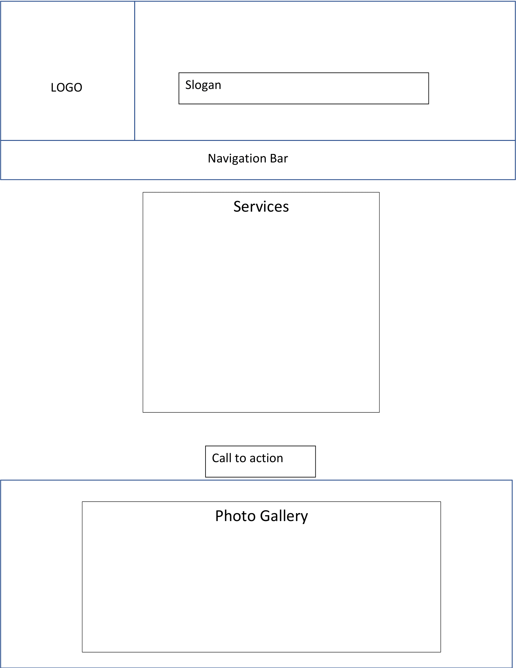
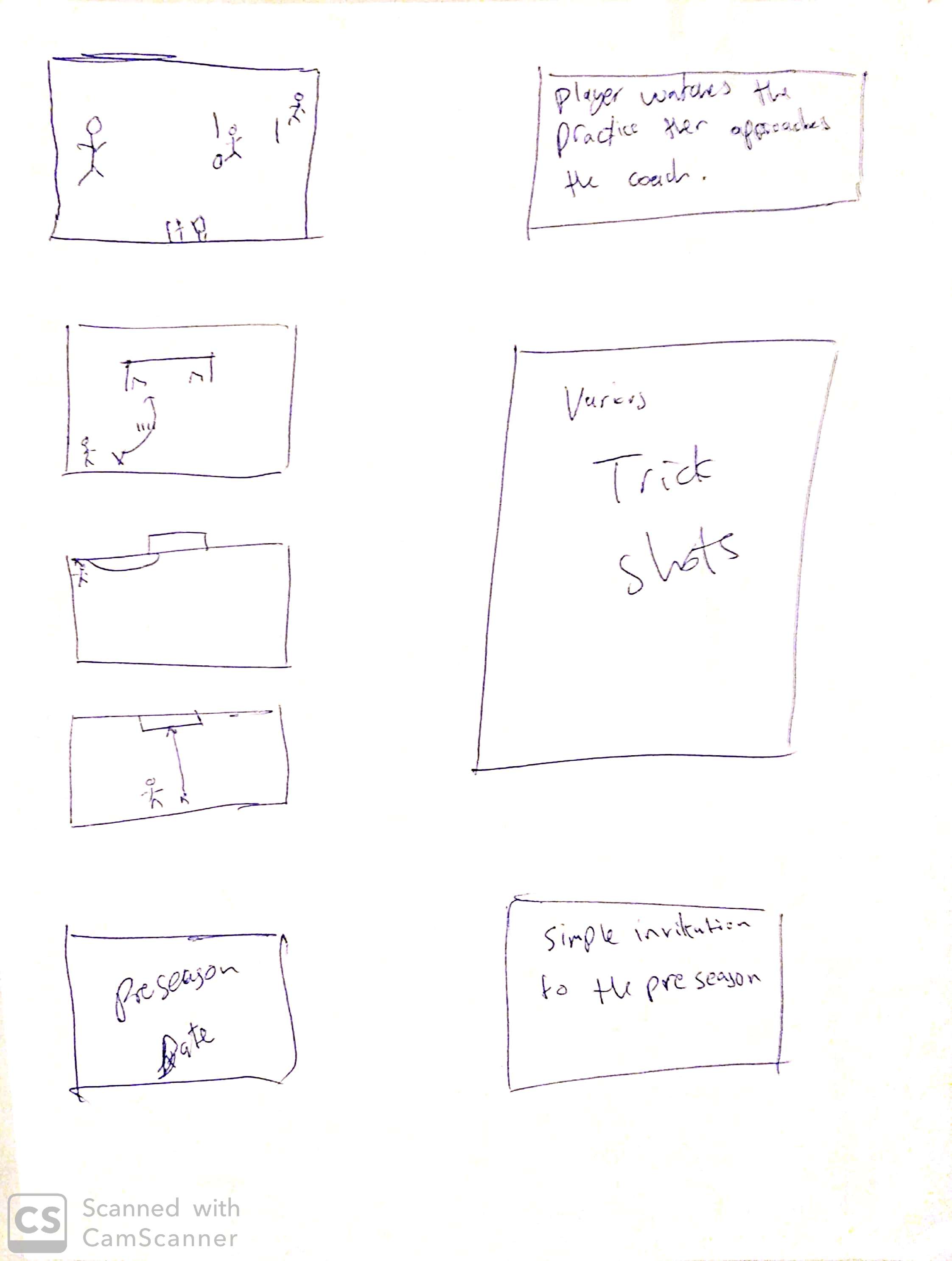
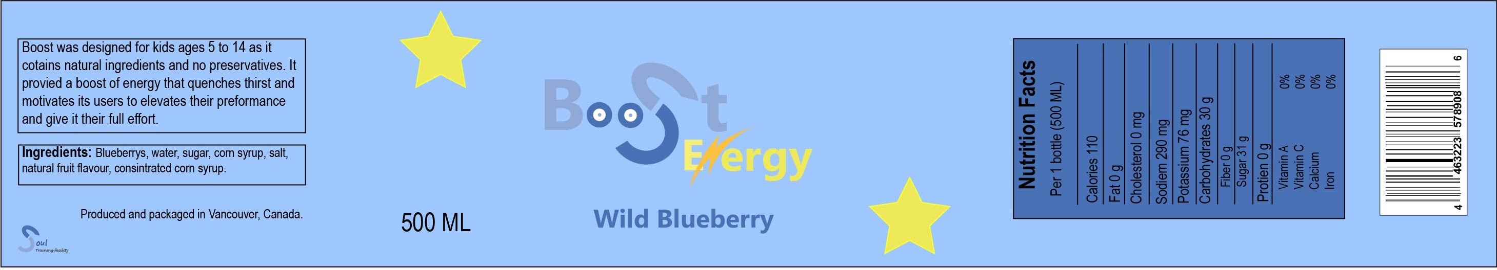
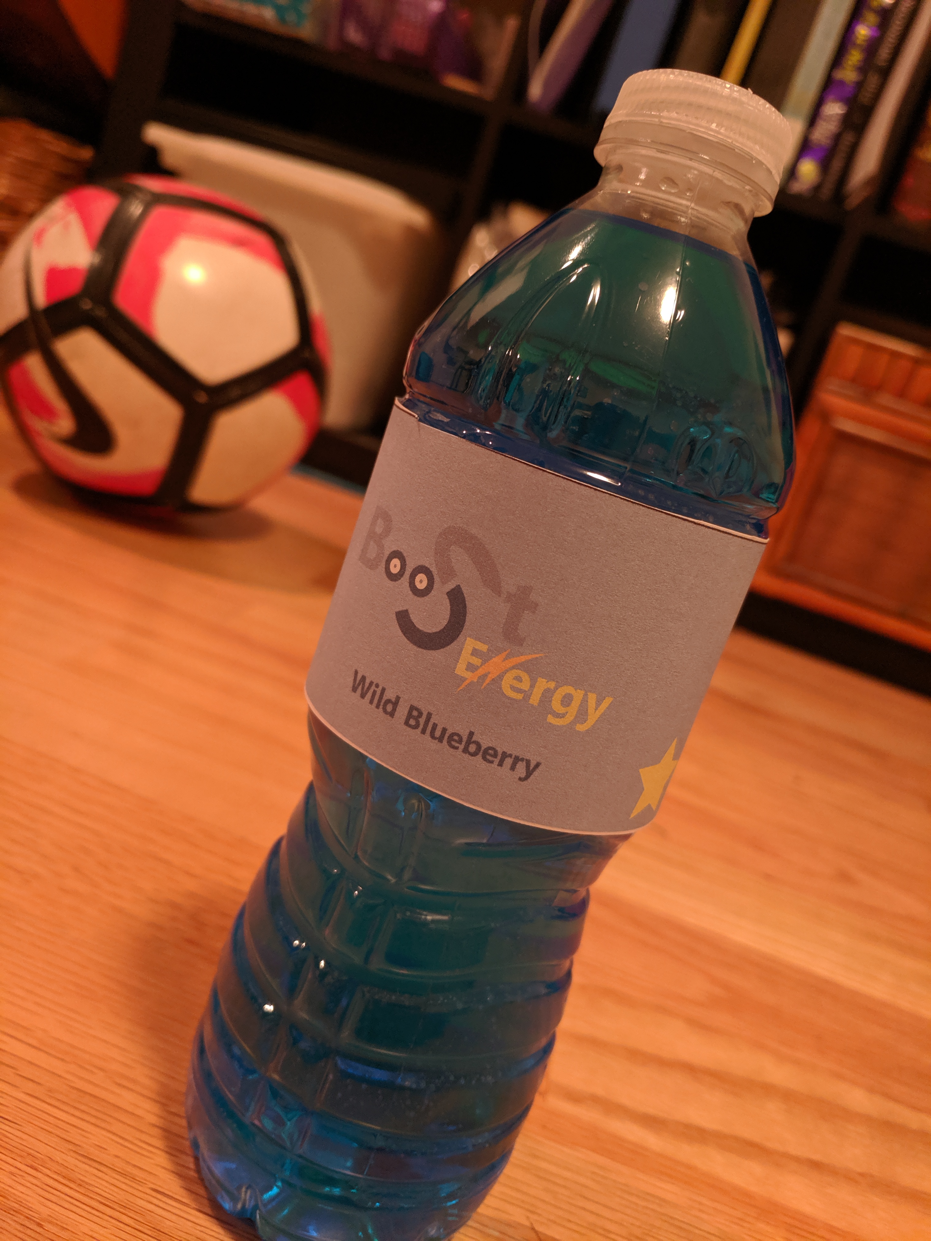
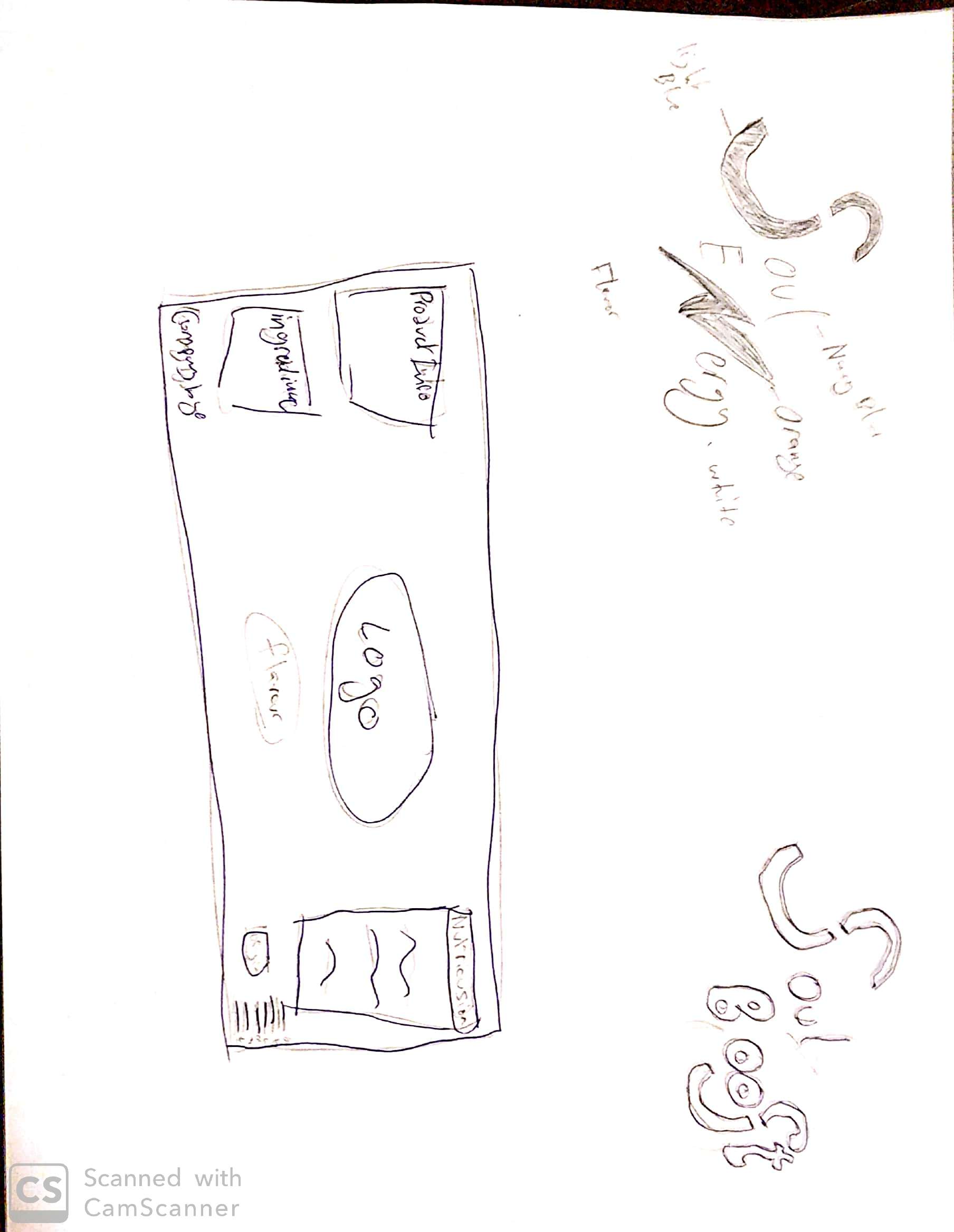
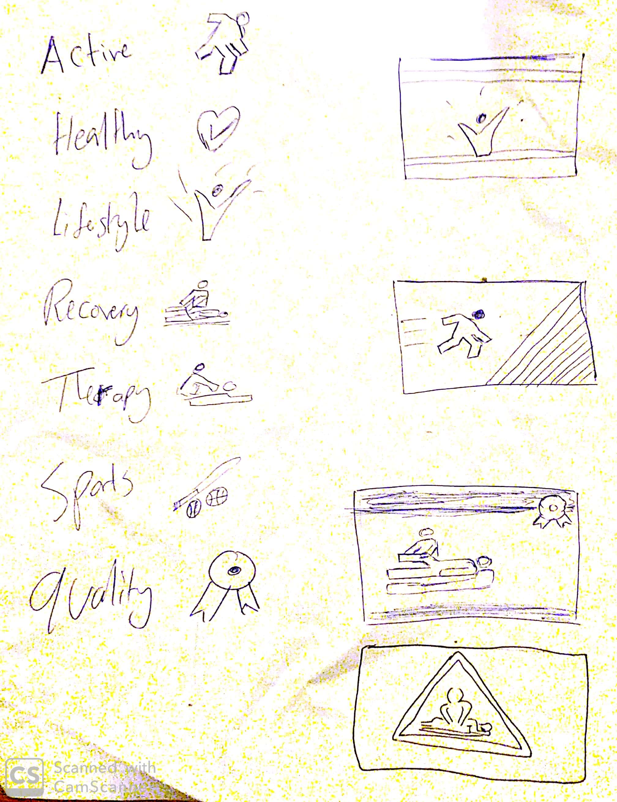
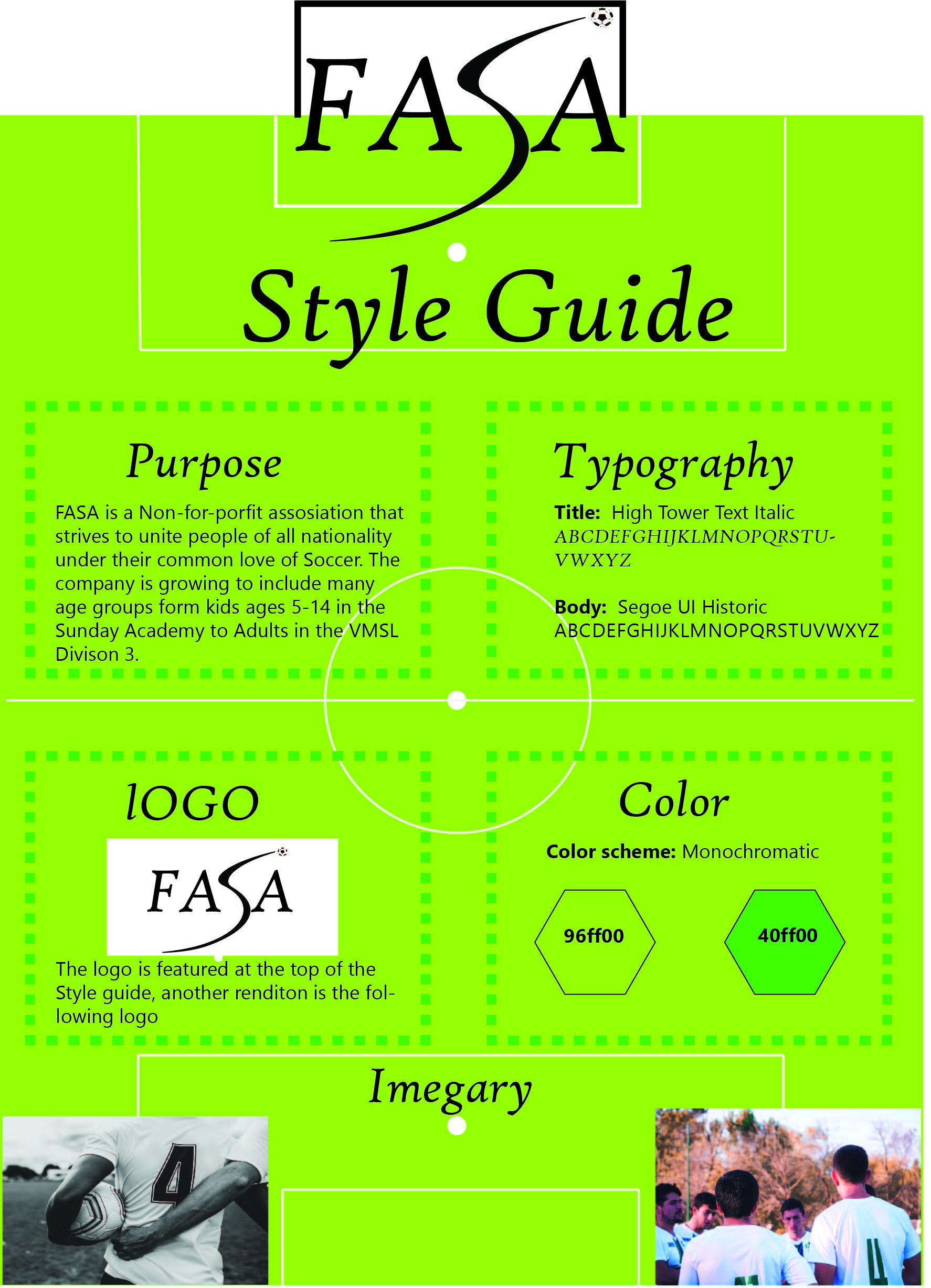
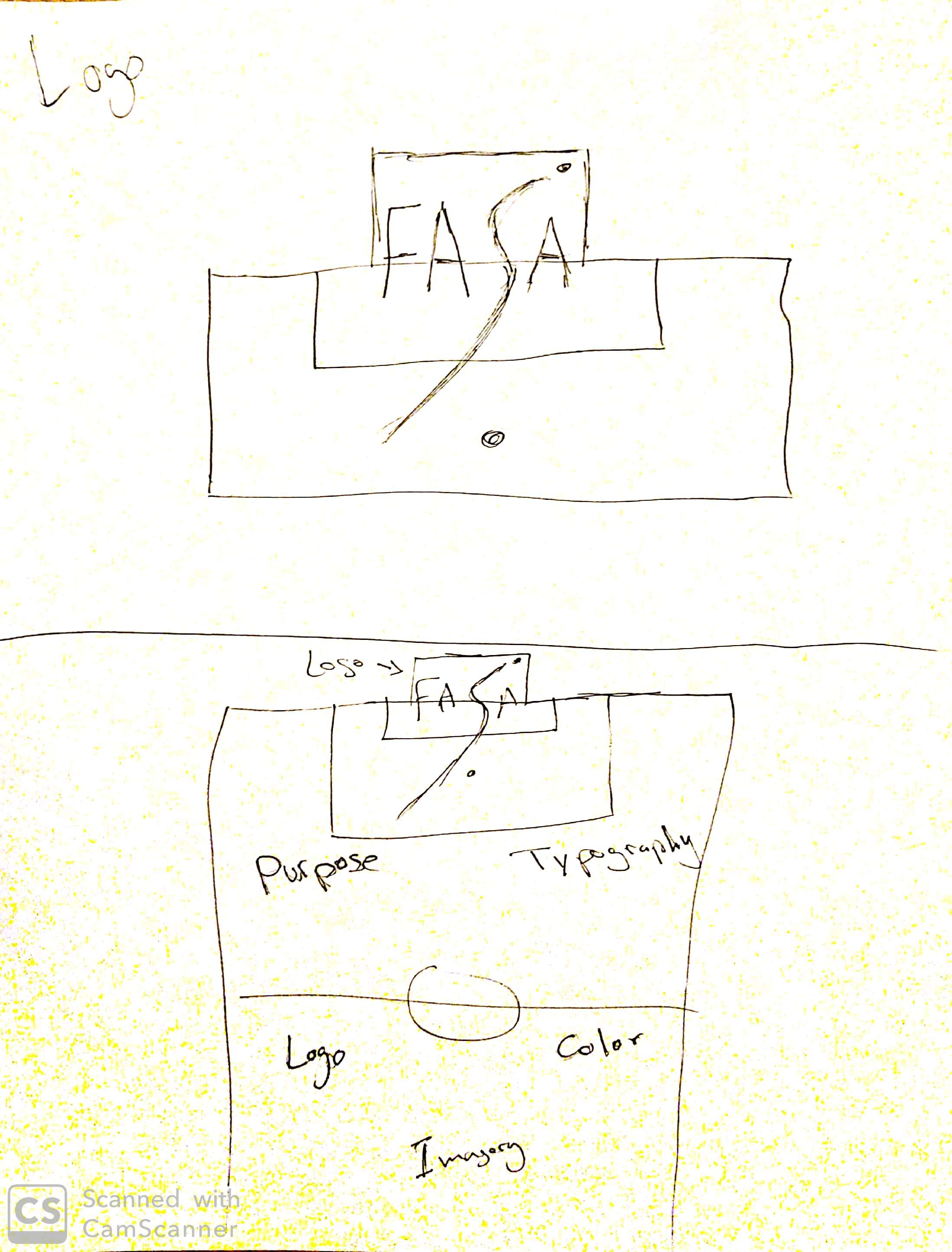
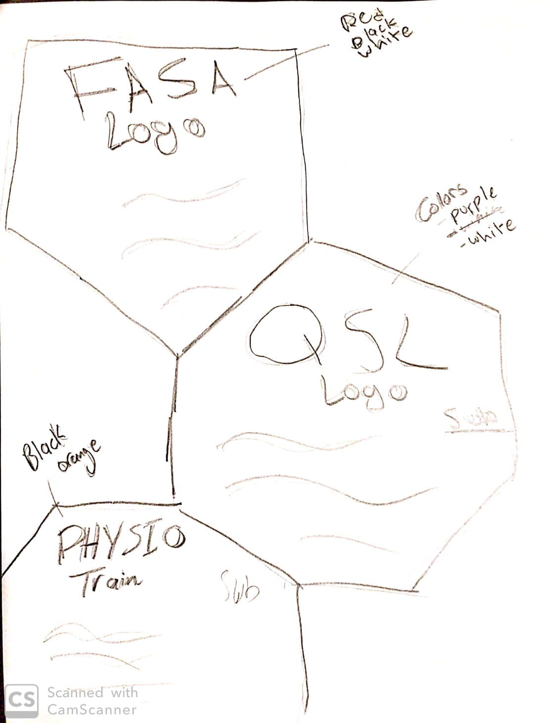
I started by looking at all the feedback I got from my professor as well as my peers, and edited/ tweaked my work until I felt comfortable with it. I had to recreate the logo completely as I was not happy with the initial design I made. After I was done editing my work. I went into word and mapped out how my PPT will look.

Once that was done, I was free to finalize my PPT and make sure all the slide lead into each other smoothly. This semester has been really fun, and full of learning experiences.

Critiques

I showed some of my work to my classmates Manisha, and Zantoza. They both gave me great feedback in terms of color schemes and alignment. They also suggested that I color code my companies so that it is easier to follow.

11C Homage page Project

Overview

For this project I had to create a home page for my subsidiary company “Physio Train”. The home page on their current site is awkward with its sizing, and does not have a clear call to action. Here is how I redesigned it:

Hompage

Process:

I first started it out by brainstorming ideas for my home page design. I took inspiration from their original page, however I tried to prioritize the services they offer. I sketched out what my layout would look like, then I made a shape map in Microsoft Word to guide me through the design.

After that I went back to Microsoft Word and completed the design for the home page. I used Orange, Black, and White as my three colors as they are the colors that make up the logo.

Critique

I got a lot of great feedback on this project, mostly because I completed earlier than usual. After I shared it on the WhatsApp group, Cameron pointed out that I didn’t include the address and phone number which are important aspects of a homepage, So I added them at the bottom in a way that would follow you as you scroll down or up. Surpreet pointed out that the “photo gallery” was too large at first, so I scaled it down. Mikal like the use of white space in the design as did many of my other group members, and Manisha suggested that I try and use a gradient for my final portfolio. All of this feedback helped me tweak the design to the way it looks right now.

Font used:

Title: Bahnschrift SemiCondensed; Body: Microsoft JhengHei UI Light.

10C Company Video Project

Overview

This week I created a 96 second video promoting the start of the preseason (August 15th) for our VMSL premier division soccer team. the video is intended for Instagram and does have more information about the dates and level required in the description.

FASA Preseason invitation.

Process

First I started by brainstorming some ideas for a promotional videos. I decided to promote our soccer team that recently enrolled in the VMSL premier division, which is the highest level of armature soccer in Vancouver. I created a story board and sketched out the main senses in my video.

Story board
sketch

The video was going to be filmed in POV from a players prospective. I set up a time with my friend and owner of FASA, and we were able to film the shots during one of his 1 v 1 sessions. After that I uploaded the footage from my Canon VIXIA camcorder onto my PC and put the video together using Windows Photos. I found it frustrating that it had no transition options, but I worked with what I had, adding music and trimming clips.

Critique

I shared the video in my groups Whats App group. Unfortunately everyone was sleeping, except for mike, who gave me positive reviews and recommended that I add more stop action shot, as well as using better software for the final portfolio edit.

9C Product Label Project

Overview

For this project I had to create a label for a product that one of my companies offers. In this case it was Soul Technical Facility. The product I choose was an energy drink for kids that was less harmful than the competition as it used natural flavour. I designed a new product logo, came up with a color scheme that suits the drink, as well as added some reoccurring design elements that gave it a “kid friendly” feel.

Product label
Boost energy drink

Process

I started by measuring the bottle that I was going to use, I went for a 500 ml bottle which proved challenging. Then I sketched out a 2 logo ideas and a layout of how the design would look.

Sketch

I ended up using a mix of the two logos and creating a new logo out of them called Boost Energy. I used Illustrator to design the label from scratch.

Critque

My group communicated through whatsApp. They gave me great advice even though it was late at night. Manisha recommended that I outline the stars with a darker shade to make them pop, and Mikal helped me with the color scheme.

8C Company Flag project

Overview

For this project I had to create a company flag for “Physio Train” a subsidiary company for FASA. The flag must be simple and elegant in design.

Process

Before designing my flag in adobe illustrator I had to sketch out some ideas on paper. I began by choosing 7 key words that are associated with the company, and gave each one of them an icon. I then used theses icons to draw out some mock designs for the flag. I ended up using a modified version of one of my sketches which I will share with you below.

Critique

I shared my ideas and design with my classmates Zantoza and Manisha through WhatsApp. They both gave me excellent feedback, Mannisha advised me to use the companies colors in the flag which I did, and Zantoza told me that it might look better if I increase the colored areas size to add more life to the design.

7C Style Guide Project

Overview

For this project I had to make a One-page Style Guide for a company of my choice. I had to recreate their logo, come up with a new color scheme, typography that works well together, as well as imagery that represented the company.

Style Guide

Process

I started out by brainstorming ideas for a new logo. Here is how the current logo looks:

Current logo

Here are my sketches:

sketch Style guide

After finishing the sketches I went into Adobe Illustrator to try and design an appealing new logo. Here is what I came up with.

Logo

After the logo was done I tried to incorporate it in gestalt design where the style guide is a soccer pitch and the logo is on the top.

Critiques

My classmates gave me some really helpful feedback as I worked on my style guide. At first I was using a black dot as the the ball, Zantoza pointed out that it may be more appealing if it was a soccer ball. Manisha helped me with the typography as I struggled to find two typefaces that mesh well together. After I sent a couple of examples both my classmates helped me land on one that works well.

6C Company plan project.

Overview

For this project, I was asked to create a company plan for all the projects that I will be designing. The company I choose was Field Art Soccer Academy, I split the projects between this company, a subsidiary company called PHYSIO Train, and a fictitious company called Soul training facility. My company plan highlights which projects will be done for which companies and gives a little bit of detail about my future plans for these companies.

Company plan

Process

I began by researching all the real companies, and gathering as much information as I can about them. This step was easy as I am very familiar with theses companies.

I then started sketching different designs until I found one that I liked. I decided to go with the gestalt design where the total image is reminiscent of a soccer ball.

Sketch Company plam

My sketching skills are not the greatest I admit, but the idea was there. Originally I wanted to partner up with the QSL (Qatar Star League) however with the help of my group members, I realized that the QSL is a far fetched subsidiary for FASA.

I used Microsoft Word to design this company plan, I layered a lot of shapes over each other to get the design I want, however I found it hard not to make it look too busy because of the amount of content that I needed to provide.

Critique

My group members helped me get the final pieces together, as we communicated through our very active group chat on WhatsApp. Zantoza advised me not to overuse colors that do not match well together, and Manisha guided me on where to place my “Audience” and “Message”. They also helped me realize that I needed to find a more realistic organization to link to FASA even if it had to be fictitious.

5C Photography/ Editing Post

Hello everyone!

For this assignment I had to take 3-4 pictures of People, Places, and Things. Then edit and tweak them using Adobe Lightroom. It was fun going around Vancouver and taking pictures of interesting subjects. I am aware that I was meant to be the one taking the photographs, which I did. However, I did include one picture featuring my soccer team and I after a tournament win on the weekend as I wanted to share the victory with all of you!

Process:

For theses photographs I used my Google Pixel Xl phone. The phone has a decent camera, however with some light editing on Adobe Lighroom I was able to drastically increase the quality of the pictures and produce a well tuned final product. After that I uploaded them to my blog and gave each one of them a fitting caption.

Critique:

For the individual pictures of the soccer players, I had shown informed them that I was taking these photos for my school assignment and showed them the pictures I took. After I edited them, I showed the players the end results and they were very impressed. One of them even featured on FASA’s Instagram page!

Welcome

Hello everyone!

My name is Riad Issa, I am a full time marketing student, and a soccer coach at FAS Academy. Through my years at Langara college I have learned valuable skills in digital, and social media marketing. I was able to use these skills to land myself a position as the Marketing Director for the soccer academy I coach at.

I am very passionate about sports and really believe in the message that FASA is trying to spread. Which is “To transform lives through soccer – we believe that children who participate in soccer learn valuable life lessons, such as developing leadership skills, ambition, inspiration, emotional strength, and hope.”

This Blog will be a gallery to showcase my portfolio for the marketing communications design class I am currently enrolled in, where I will be sharing various design ideas relating to FASA. Looking forward to all your valuable feedback and advice!